Website - main communication tool
Published on 30 March 2017
A project without promotion might as well not exist. Presenting a project to the professional as well as lay public is important. The project Books Discovered Once Again is interdisciplinary, connecting historical research with librarianship, and this is why we hope it will inspire others. This is why we take the project promotion seriously. For us, the main communication channel is our website. And how have we created, changed and developed it?
From wireframes to the first version
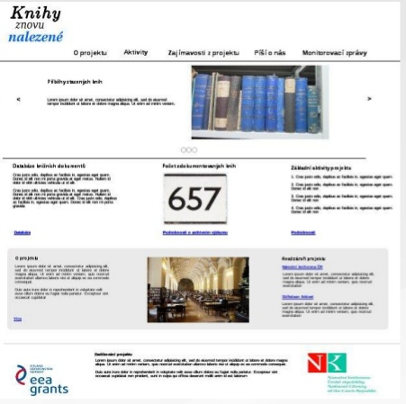
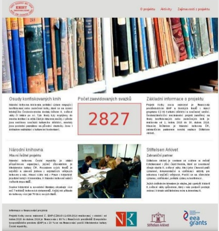
Right after the beginning of the project, we started to plan our website, as we set ourselves the task of launching its first version only two months after the project’s commencement. First, we planned the main structure of our website using wireframes. We used MockFlow, which, in its paid version, allows creation of a dynamic prototype with functional links, allowing stimulation of a full user experience. To implement the website, we used a free static web page template, Bootstrap Modern Business, which is responsive, allowing the website to work well on mobile devices, too. In addition to our homepage, the static pages About the project and Activities were created. A tracker registering the number of catalogued volumes became an important part of our homepage. It allows users to follow our progress towards the goal to catalogue 12,000 volumes.
 Wireframes of our website.
Providing information on regular basis - a blog integrated into the website
A month later, we added the Findings sections, which is actually a blog which we use to publish interesting findings, write about lectures we have organized, summarize activities we have been involved in and reveal the project’s background. One of our goals was to present the work of our librarians. Already in the first stage of the project, a series of five articles was produced, describing the cycle a book goes through in the project, from its selection, cleaning, preparation for processing, cataloguing, making it accessible to readers and digitalization. So far, 34 articles in Czech and 31 in English have been published in the Findings section (we are working on further translations).
 For a great part of the project, a carousel with rotating pictures was placed on our homepage.
When the website was extended, we added the section Media Here, the list of past and planned lecture activities is published, together with responses from the Czech and foreign media, including professional periodicals. This section also includes an integrated feed from the National Library's Facebook, which we use for promotion, from the Facebook page of our Norwegian colleagues and also from Twitter.
As the project is international, an English version of our website is a must. It was launched in the third stage of the project expansion. After the realization of the virtual exhibition, we integrated it into our website by creating a bookmark in the main menu with the link to an independent virtual exhibition running in its own domain.
The project’s expansion called for structural changes in our website
The expansion of the project required a change in the website’s layout. We needed to find space for presentation of historical studies dedicated to original owners of the books, and for publishing information concerning the activities within the funded bilateral initiatives. The bookmarks About the project, Media and Activities were merged into one bookmark in the main menu, called About the project. This gave us more room for new bookmarks:Owners (divided intoHolders a Multimedia holders and BFB iniciatives, which has the same structure as the Findings blog.
New homepage
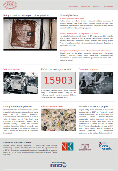
 New look of our homepage. We gave our promotional video the forefront place and emphasised the latest and the most important articles.
Within the expansion of our project, we created a promotional video. We thought it would be a shame to inform the project's fans about it only in one article on the blog, and so we decided to take away the carousel on the homepage and replace it with this video. This also gave us space next to the video, which we now use to highlight the interesting or the most recent articles, to allow easy orientation among the number of articles posted. Originally, the homepage was designed to provide basic information about the project and the institutions behind it. Later, we decided to use it in a different way and to emphasise interesting outputs created within the project. An educational programme was prepared by our colleagues from the Norwegian institution Stiftelsen Arkivet. It is run on a separate website, and includes four interesting stories associated with our books and the historical events. We consider the virtual exhibition and the educational programme to be of the same importance and so we placed their links in the form of pictures on the second line of our homepage. A collage of stamps, inviting users to read the profiles of the original owners of the books, is placed on the third line, together with basic information about the project.
Valuable results of statistics - traffic
The number of visits to our website since its launch is 125,829 (without robots searching the Internet), of which 28,758 are unique visitors. Approximately 12% of visitors (15,195) have accessed the website via mobile devices, with 10,276 Android accesses. 89,396 visitors accessed the “knihyznovunalezene.eu” website directly. 1,554 visitors came via Google.cz and 415 via Google.com search. Promoting the project in the media has certainly paid off - 376 visitors came to our web via the link in the article on the Lidovky.cz server.
The virtual exhibition has its own domain at www.exhibition.knihyznovunalezene.eu, so we have been able to track its traffic separately. There have been altogether 77,230 visits (without robots), of which 6,842 are unique visitors. 8,086 visitors used mobile devices to view the exhibition (11%); in this case iOS (5,163) had the majority over Android (2,923). In the vast majority, visitors looked directly at the virtual exhibition's website. It is rather surprising that only 266 visitors went to the exhibition website via the link on the project's web and 277 visitors found it using Google.com, and 70 using Google.cz.